

This post contains affiliate links. We may earn a commission if you click on them and make a purchase. It’s at no extra cost to you and helps us run this site. Thanks for your support!
Say Goodbye to Excel — This New AI Chart Tool is a Game Changer
Excel? Outdated. Napkin? Revolutionary.
Gone are the days of fumbling with cells and formulas just to build a half-decent graph. Napkin, a sleek AI-powered visual tool, is turning the world of data visualization upside down—and fast.

Drop your numbers, type a prompt, and watch Napkin morph raw info into engaging, eye-popping visuals. Whether you’re showcasing business milestones, fitness stats, or a side hustle’s sales, Napkin crafts instant graphs, timelines, and icon-studded charts that are ready to share or download (PNG, PDF, SVG—your choice).
No design skills? No problem.
Napkin is intuitive—like having a designer and analyst rolled into one.
Here’s a quick breakdown:
Step 1: Sign In
Use Google or email. Quick, seamless, done.
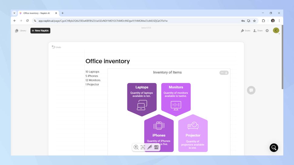
Step 2: Insert Your Data
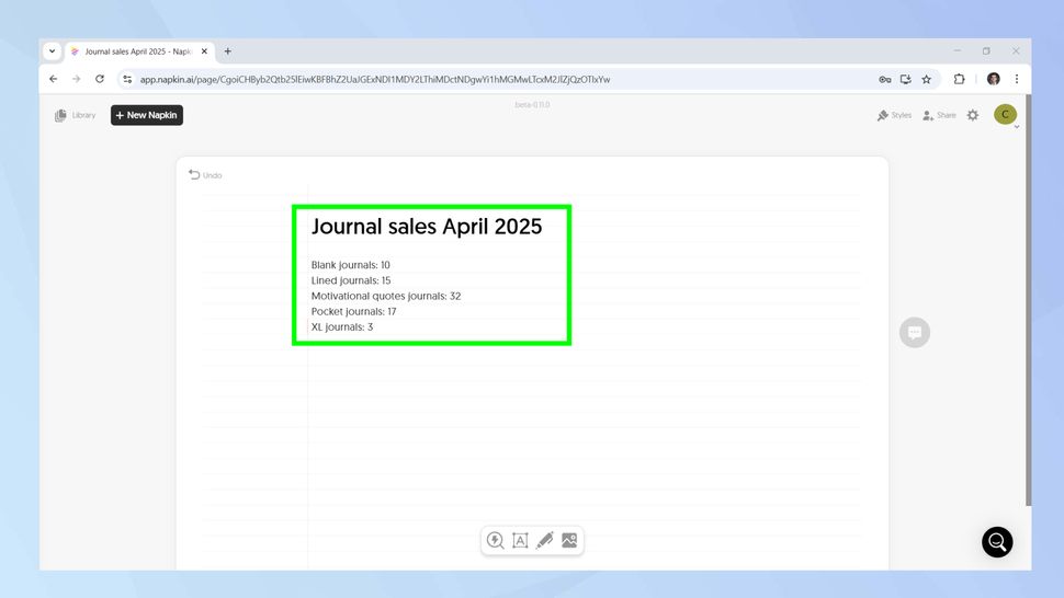
Like ChatGPT, there’s a prompt box. Input your info—numbers, dates, details.
Step 3: Generate
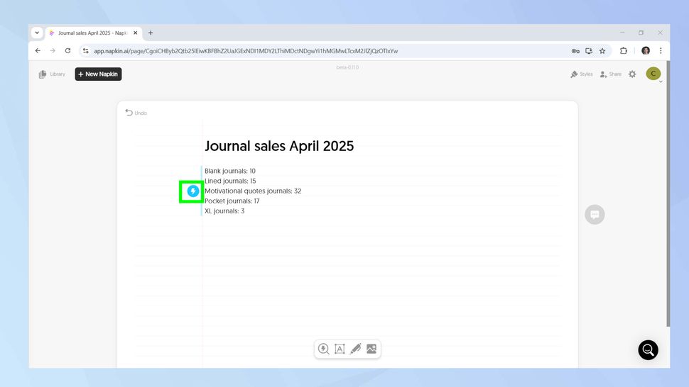
Hit ⚡ and bam! Your visual is born in seconds.
Step 4: Tweak the Style
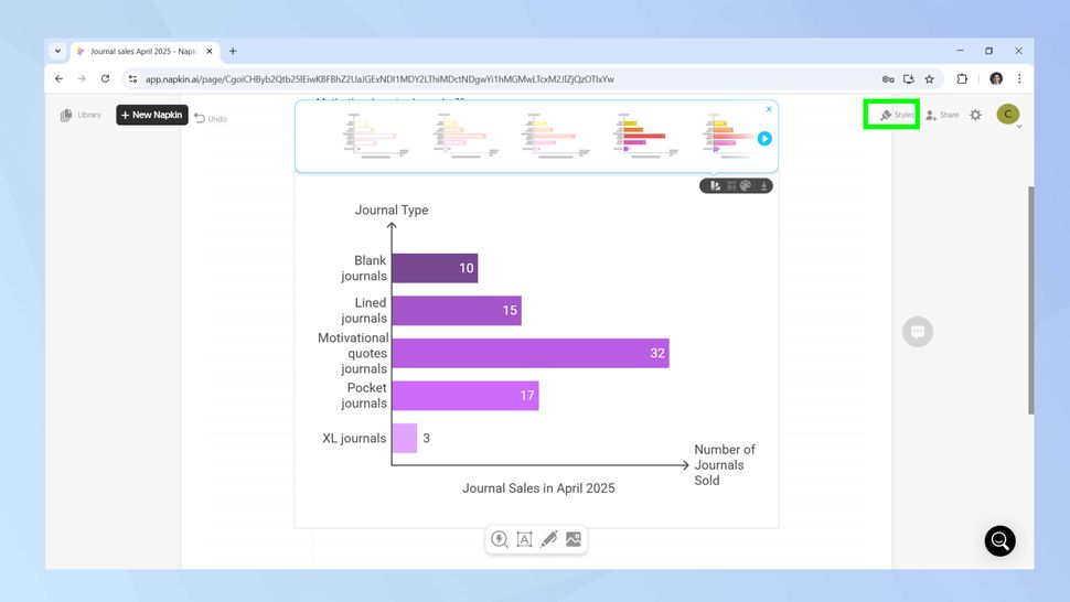
Hover, click “Change Style,” and explore new looks instantly.
Step 5: Add Sketches
Some styles let you add visual flair—icons like phones, laptops, graphs.
Step 6: Timeline Magic
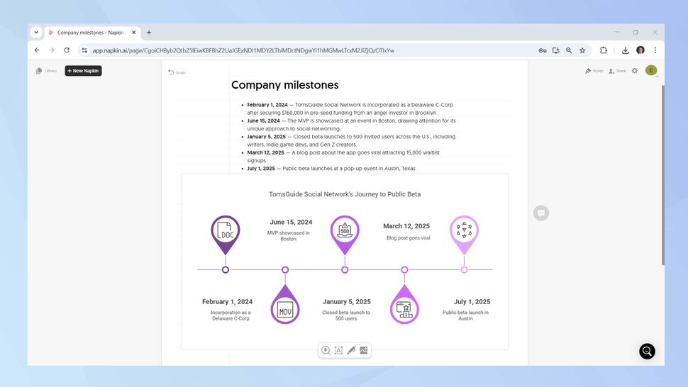
Napkin reads your milestones and auto-generates a timeline with matching visuals.
Step 7: Let AI Calculate
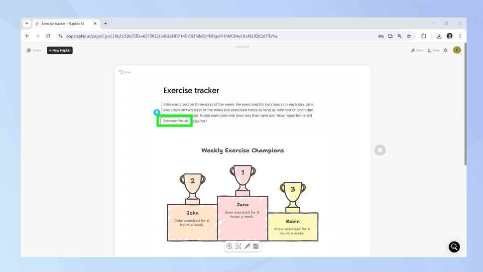
Need quick math? Type the data, and Napkin does the rest, plus visuals.
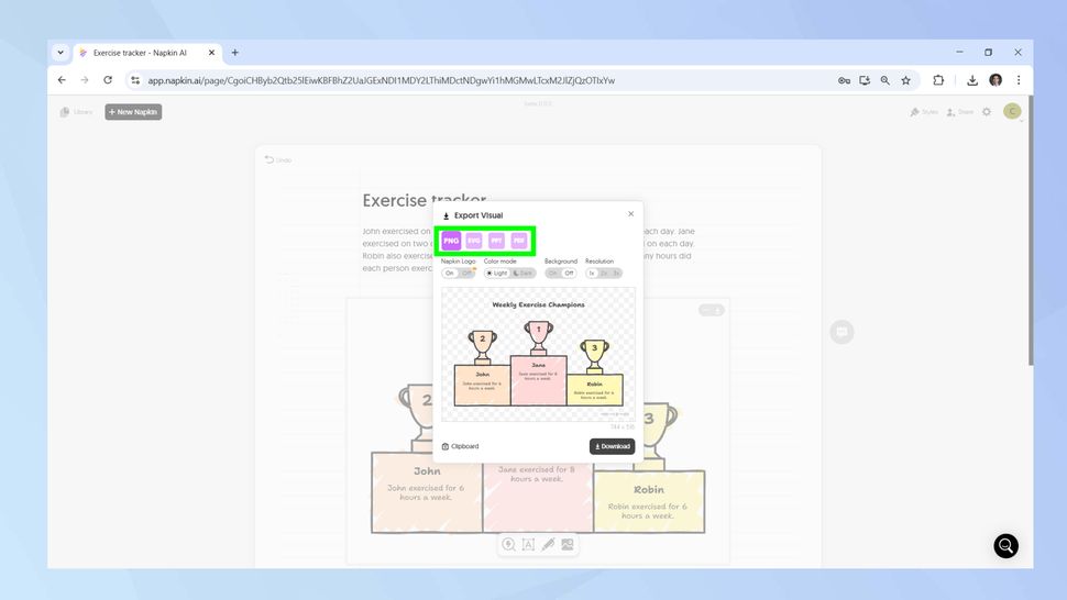
Once done, hover over your creation and click Export.
Choose your format, download, and it’s yours to keep or share.
Oh—and yes, there’s a free plan. Limited, but surprisingly generous.
Conclusion
In a world where data overload is real, Napkin gives you the power to communicate with clarity, speed, and creativity. No more chart chaos. Just plug, play, and present like a pro.