

This post contains affiliate links. We may earn a commission if you click on them and make a purchase. It’s at no extra cost to you and helps us run this site. Thanks for your support!
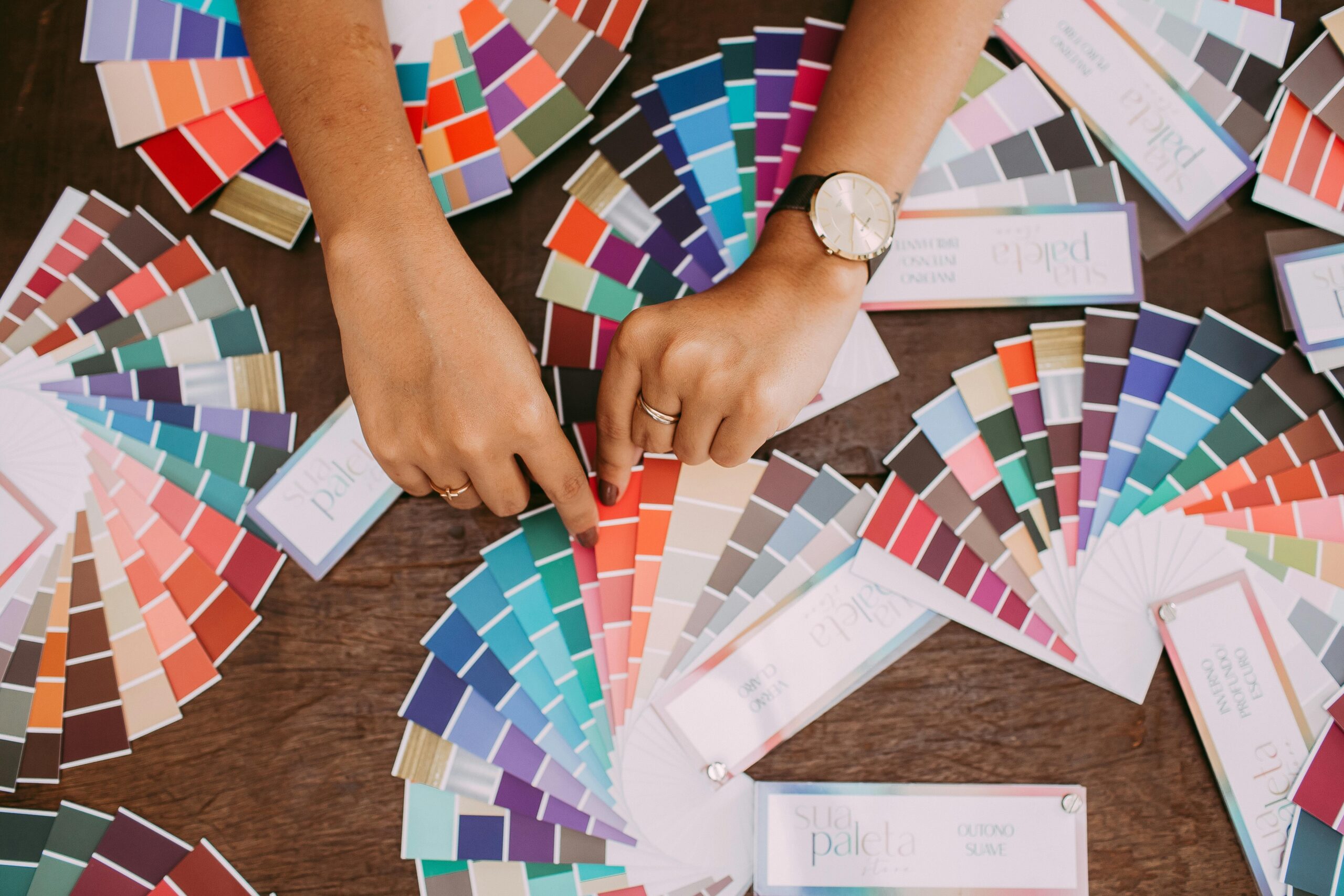
When it comes to graphic design, choosing and combining colors can often feel like a game of trial and error—a bit like trying to bake a cake without a recipe. The stakes? A design that falls flat fails to engage, or worse, alienates its audience. But what if I told you that mastering colors isn’t as mystical as it seems? With the right techniques and a sprinkle of creativity, you can elevate your visuals from ordinary to extraordinary.
Color is more than just decoration; it’s a tool of persuasion, emotion, and impact. It’s what makes a brand unforgettable, a website immersive, or a poster impossible to ignore. If you’re ready to unlock the secrets behind successful color combos and harness their full potential, read on. Let’s dive deep into the magical realm of color theory.
The Color Wheel: Your North Star in Design

Let’s start with the basics: the color wheel. Far from just a rainbow in a circle, the color wheel is your ultimate map for creating harmonious combinations. At its core are the primary colors—red, yellow, and blue—building blocks that cannot be made by mixing other shades.
From there, we get secondary colors—orange, green, and purple—formed by combining two primaries. Add another layer, and we have tertiary colors, which are blends of primary and secondary shades, like blue-green or red-orange.
To navigate the wheel effectively, you’ll need to understand three critical concepts:
- Hue: The base identity of a color (red, blue, green, etc.).
- Saturation: The intensity of a color—whether it’s vibrant or muted.
- Value (Brightness): How light or dark a color is, akin to adding white or black.
Mastering these elements equips you to make intentional, harmonious choices rather than accidental clashes.
Finding Harmony: Color Relationships Unveiled
The magic of the color wheel lies in its ability to reveal harmonious relationships between colors. Let’s explore the most effective schemes:
- Complementary Colors: Located opposite each other on the wheel (e.g., blue and orange), these combos create high contrast, making designs pop. Use sparingly to avoid overwhelming your audience.
- Analogous Colors: Neighbors on the wheel (e.g., green, blue-green, and blue) produce a soothing, cohesive effect. Perfect for calm, unified designs.
- Triadic Colors: Spaced evenly around the wheel (e.g., red, yellow, and blue), this scheme provides vibrant balance without chaos.
Color Psychology: The Emotional Spectrum
Every color tells a story, evoking specific emotions and setting the tone for your design. Understanding these associations can give your visuals an edge:
- Red: Bold, passionate, urgent. Ideal for action-driven messages.
- Blue: Trustworthy, calming, professional. Suits corporate and tech industries.
- Green: Fresh, natural, healthy. Works well for eco-friendly or organic brands.
- Yellow: Cheerful, creative, optimistic. Perfect for spreading positivity.
- Orange: Warm, enthusiastic, playful. Adds energy without overwhelming.
- Purple: Luxurious, imaginative, regal. Great for high-end or creative projects.
- Black: Sophisticated, powerful, elegant. A favorite for minimalistic, high-impact designs.
- White: Pure, clean, modern. Offers a fresh and uncluttered vibe.
Remember, color meanings can differ across cultures, so always consider your audience.
Practical Strategies: The 60-30-10 and 60-40 Rules
Creating balanced compositions doesn’t have to be complicated. These two rules offer foolproof guidelines:
- 60-30-10 Rule (Three Colors):
- 60%: Dominant color for backgrounds or large elements.
- 30%: Secondary color to complement the dominant shade.
- 10%: Accent color for emphasis on buttons, calls-to-action, or highlights.

- 60-40 Rule (Two Colors):
- 60%: Dominant base color.
- 40%: Secondary accent color for text or key elements.

These proportions create visual balance, ensuring one color doesn’t overpower the others.
Applying Color Theory: Real-Life Examples
Picture this: You’re designing a website for a sustainable coffee brand. What colors might you use? A soft green as the dominant color conveys nature, earthy browns provide a grounded secondary shade, and a splash of yellow adds vibrancy to call-to-action buttons.
Now, consider a cutting-edge tech startup. Cool blues set a professional tone, complemented by sleek grays, with an accent of bold purple to signal innovation and creativity.
Expert Tips for Effortless Color Mixing
- Start Small: Stick to two or three colors initially.
- Use Online Tools: Color palette generators like Adobe Color can help you find stunning combinations.
- Study Inspirations: Analyze successful designs to understand their color logic.
- Experiment Fearlessly: Your instincts can lead to breakthroughs.
Conclusion: Begin Your Color Mastery Journey
The world of color may seem complex, but with practice and a clear understanding of the basics, it’s a skill anyone can master. Let your designs tell stories, evoke emotions, and captivate audiences.
Remember, the key lies in intentional choices. Whether you’re working on a minimalist logo or an intricate web page, your colors should align with your message. So, grab your color wheel and start experimenting—your masterpiece awaits!