

This post contains affiliate links. We may earn a commission if you click on them and make a purchase. It’s at no extra cost to you and helps us run this site. Thanks for your support!
A Logo Can Make or Break Your Brand
Have you ever looked at a logo and thought, Something feels off—but you couldn’t quite pinpoint why? Or worse, have you ever worried that others feel this way about your logo? You’re not alone.
Logo design isn’t just about slapping together text and graphics. It’s about crafting an identity, an instant recognition factor, and a long-lasting impression. A well-designed logo can elevate your brand, but a poorly executed one can damage credibility, confuse potential customers, and weaken your brand’s impact.
The good news? Many logo design mistakes are easy to identify and fix—if you know what to look for. Let’s break down five of the most common logo design traps, why they’re a problem, and how you can correct them right now.
1. Overcomplicated Design: Less is More
Ever seen a logo that tries to do too much? Too many colors, intricate patterns, excessive details—it all leads to visual chaos.
Why This is a Problem:
- Overly complex logos are hard to scale and reproduce across different mediums.
- They lack clarity and are difficult to recognize at a glance.
- Too much detail makes your brand look cluttered and unprofessional.
The Fix:
- Simplify! Strip your logo down to its essential elements.
- Limit your color palette to two or three core colors.
- Opt for clean, bold shapes that remain recognizable even when scaled down.
- Test your logo in black and white to ensure clarity.
Pro Tip:
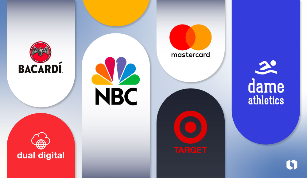
The best logos—Apple, Nike, McDonald’s—are incredibly simple yet iconic. Aim for timeless minimalism over fleeting trends.
2. Using Generic, Overused Symbols
Light bulbs for ideas. Gears for technology. A globe for global reach. Sound familiar? These symbols are everywhere, and that’s exactly the problem.
Why This is a Problem:
- Overused icons make your brand look generic and uninspired.
- They fail to establish a unique brand identity.
- Customers may struggle to distinguish your brand from competitors.
The Fix:
- Think outside the box. Instead of obvious visuals, find abstract or custom elements that represent your brand’s values.
- Sketch different variations and experiment with unique shapes or symbols.
- If you must use a well-known symbol, find ways to stylize it uniquely.
Pro Tip:
A memorable logo isn’t about being obvious—it’s about being distinct.
3. Poor Font Choice: The Silent Brand Killer
Typography speaks volumes about your brand’s personality. But when fonts are chosen carelessly, they can completely ruin an otherwise great logo.
Why This is a Problem:
- Using too many fonts creates visual clutter.
- Hard-to-read fonts reduce brand recognition.
- Clashing typography weakens your logo’s overall impact.
The Fix:
- Stick to one or two complementary fonts max.
- Choose legible, professional typography that aligns with your brand’s personality.
- Experiment with font weights and spacing to add hierarchy without overcomplicating the design.
Pro Tip:
Your font should be readable at any size. Test it on both large banners and tiny social media icons to ensure clarity.

4. Ignoring Color Psychology: Colors Communicate
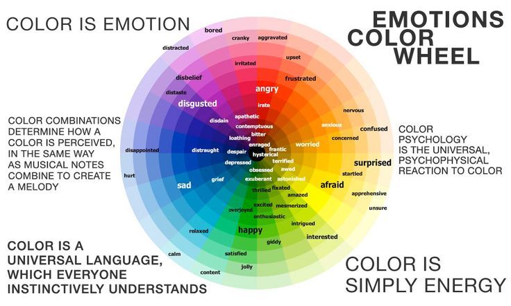
Color is more than just an aesthetic choice—it’s a psychological tool that shapes perception and evokes emotions.
Why This is a Problem:
- Colors that don’t align with your brand’s values send the wrong message.
- Poor contrast can make your logo hard to read.
- Cultural differences in color perception may alienate audiences.
The Fix:
- Research color psychology and select shades that reflect your brand’s identity.
- Use a balanced palette—vibrant for playful brands, muted for professional ones.
- Ensure strong contrast so your logo remains visible across different backgrounds.
Pro Tip:
Blue conveys trust and professionalism, red evokes passion and energy, and green symbolizes growth and nature. Choose wisely!
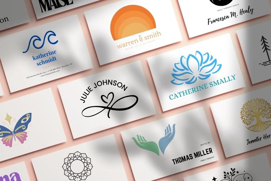
5. Lack of Versatility: One Size Does Not Fit All
Your logo must work seamlessly across various platforms, from business cards to billboards to mobile apps.
Why This is a Problem:
- A logo that only works in one format limits branding opportunities.
- Intricate details may become unrecognizable in smaller sizes.
- Some designs don’t translate well into black-and-white versions.
The Fix:
- Design a responsive logo with multiple variations (full, simplified, icon-only).
- Test your logo across different sizes and backgrounds.
- Ensure it works equally well in color, grayscale, and monochrome.
Pro Tip:
A great logo adapts. It remains strong whether it’s printed in a newspaper or displayed as a tiny app icon.
Need Professional Help? Here’s Your Solution
Not everyone is a design expert—and that’s okay. If you need a polished, professional logo, consider working with an experienced designer or using high-quality templates.
Option 1: Hire a Professional Designer
An expert designer can craft a unique, custom logo that embodies your brand’s essence. Platforms like Fiverr or Upwork offer access to talented designers specializing in logo design.
Option 2: Use Customizable Logo Templates
If you’re on a budget but still want a high-quality logo, customizable vector templates are a great alternative. Sites like Envato Elements and Creative Market offer stunning, editable designs.
Final Thoughts: Does Your Logo Pass the Test?

Take a step back and analyze your logo. Does it:
✅ Keep it simple and clean?
✅ Use unique, non-generic elements?
✅ Feature readable, professional typography?
✅ Have intentional, well-balanced colors?
✅ Work across different formats and sizes?
If you answered no to any of these, it might be time for a redesign. Fix these common mistakes, and your logo will transform from forgettable to iconic.
Your brand deserves a logo that captures attention, builds trust, and stands the test of time. Ready to level up?